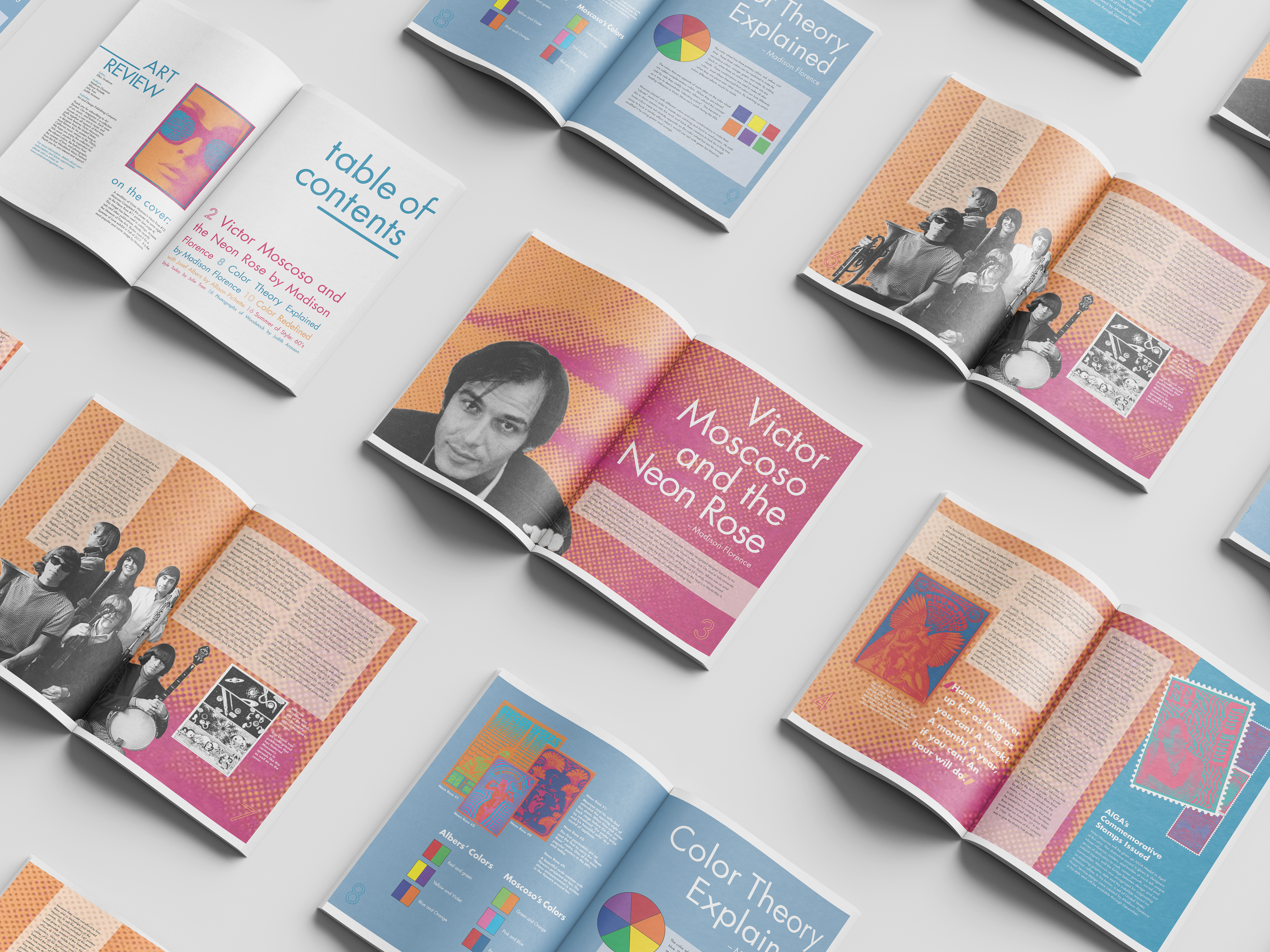
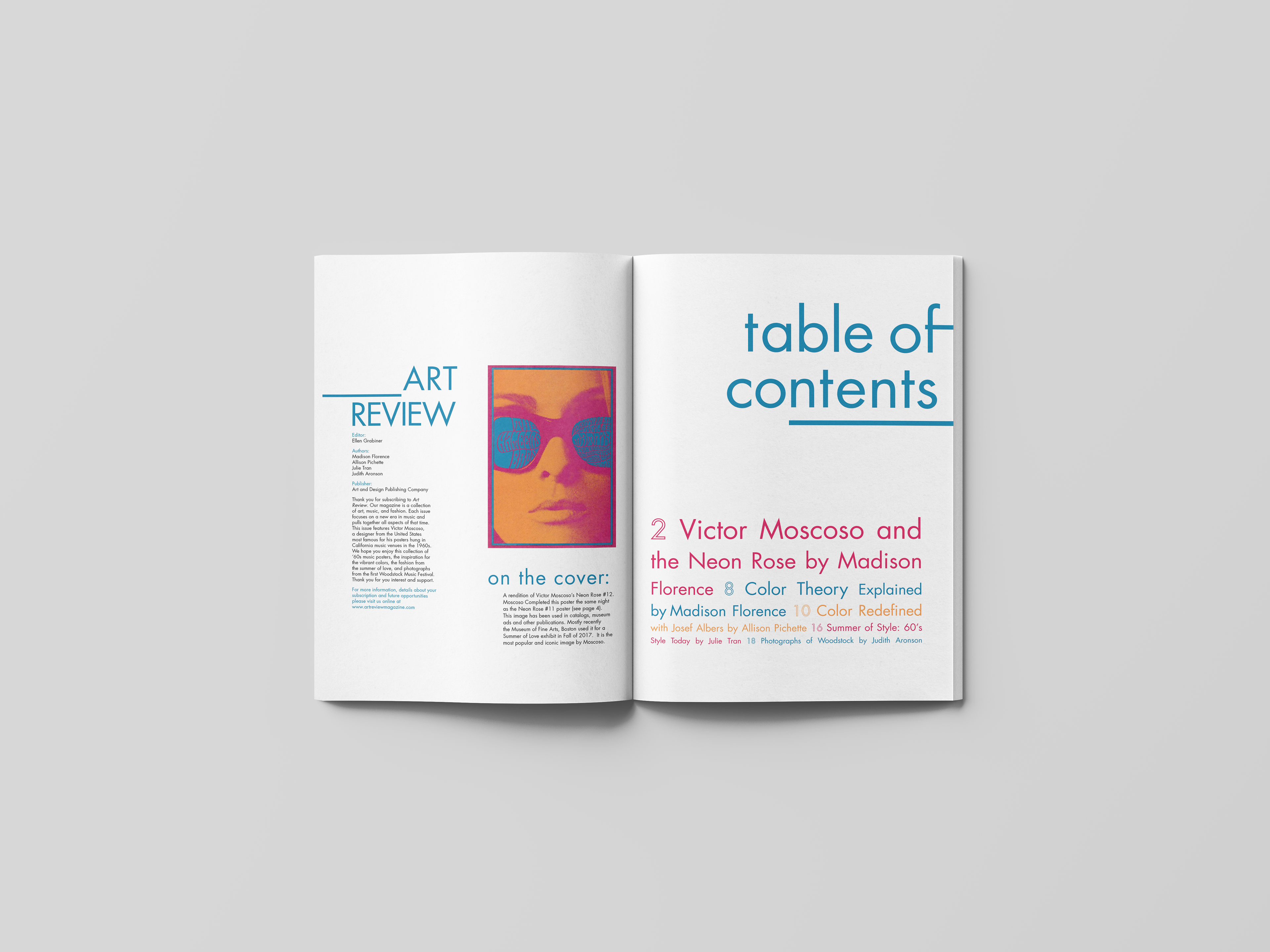
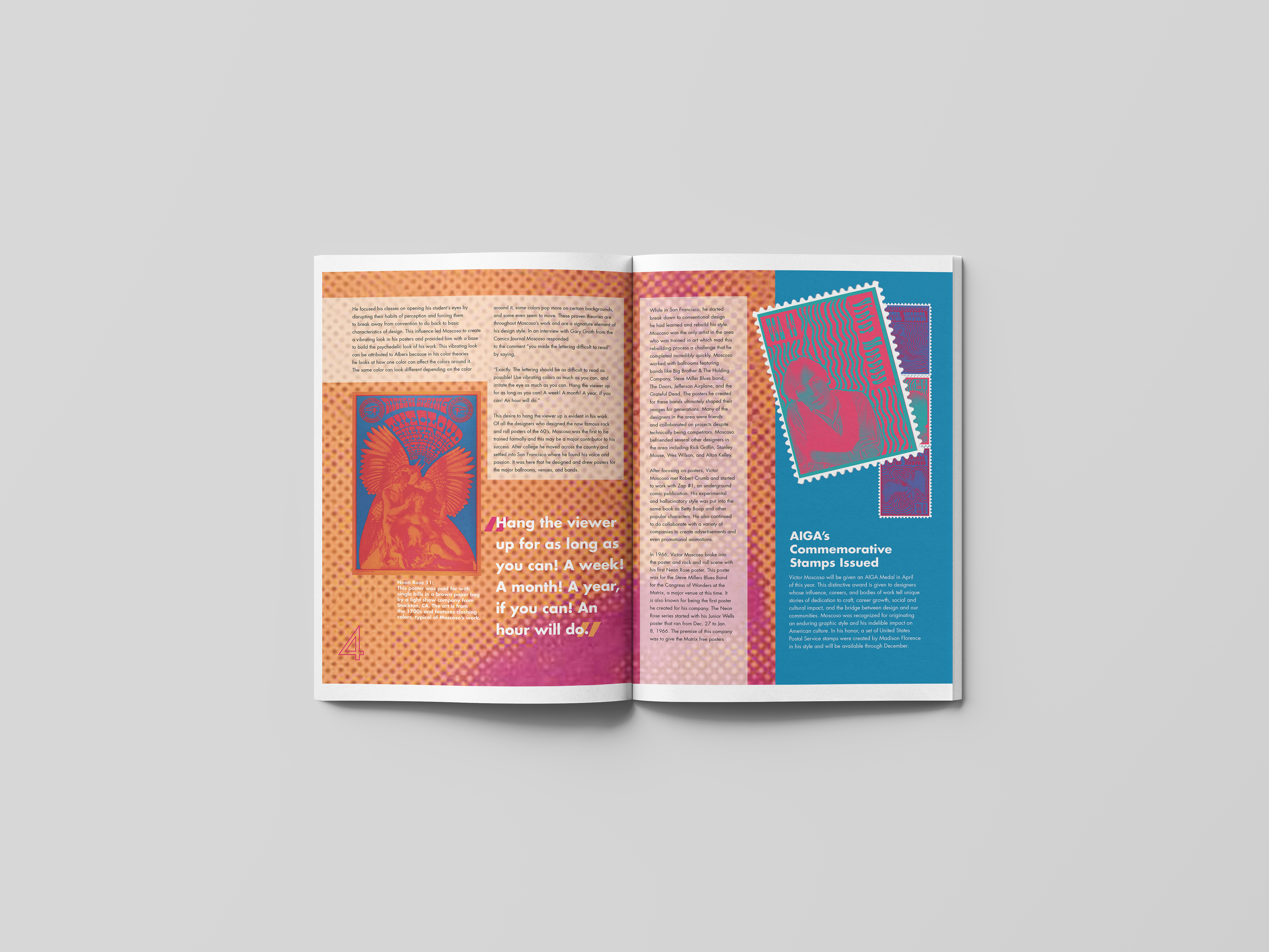
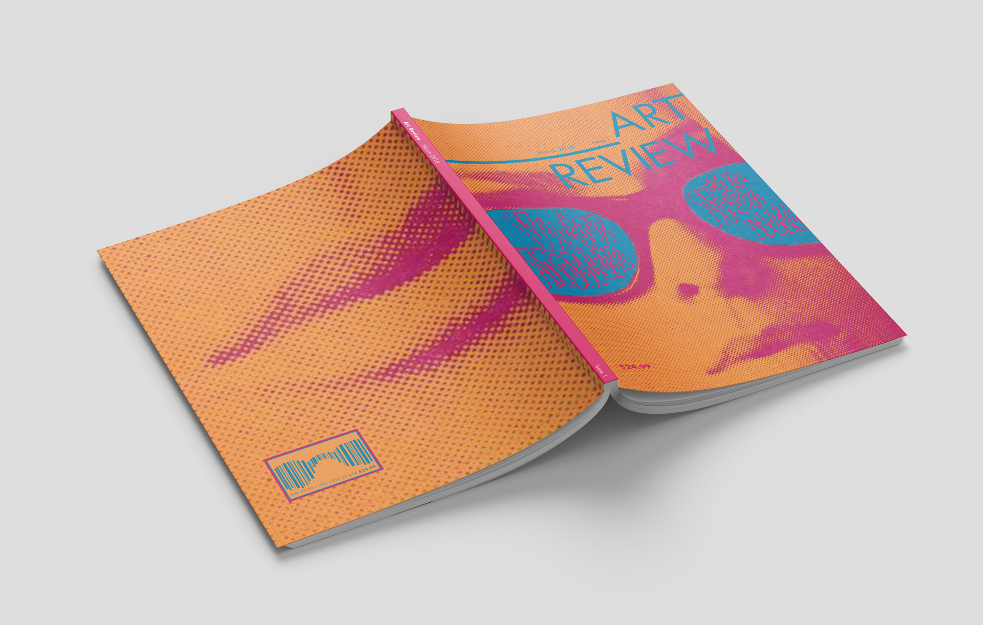
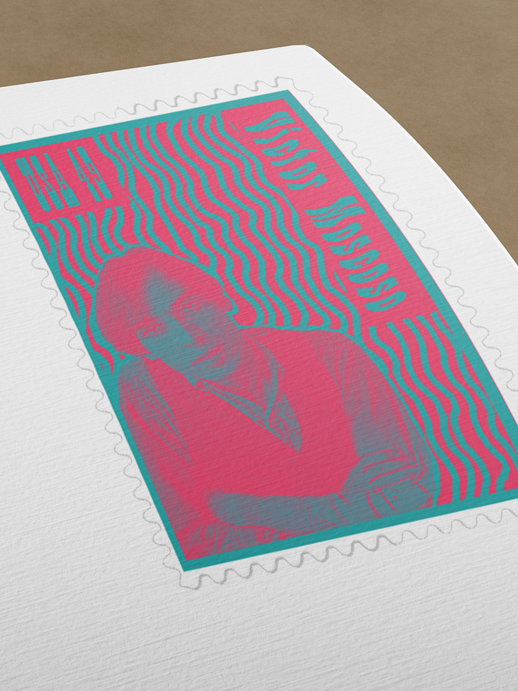
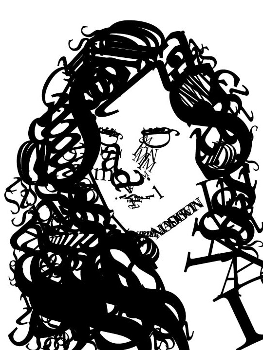
This mock up of a fictitious magazine was the next step in my series of Victor Moscoso inspired pieces. His design style lead to the creation of the stamp set and then influenced the style of the magazine. The cover is a play on one of his posters. The table of contents is inspired by the concert posters created in the 1960s and 1970s with a large amount of text was listed in decreasing size. While this is typically done in psychedelic typefaces, often hand drawn by the artists, I chose a more legible font to fit the modern era. The layouts, editing, and copy were all created by me and represents the diversity of my design abilities as well as my ability to do research and learn more about a topic.
