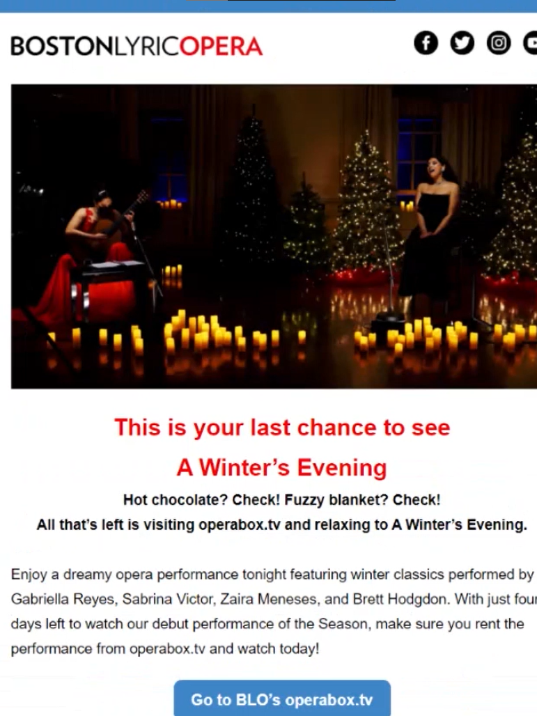
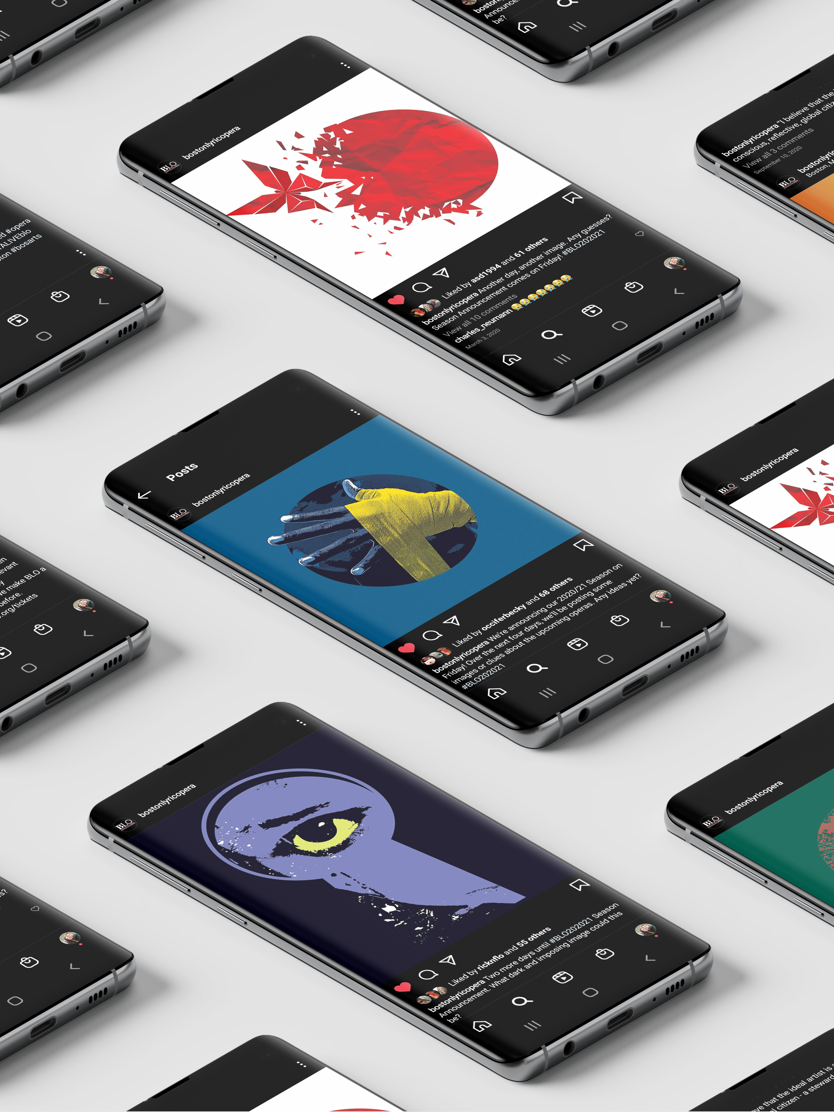
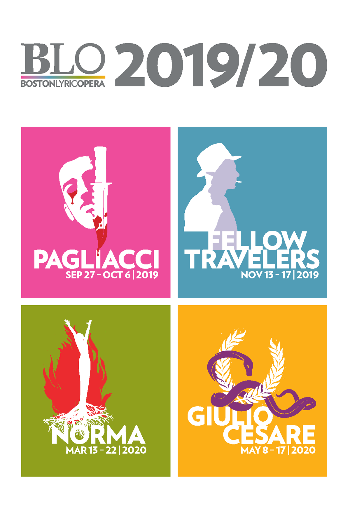
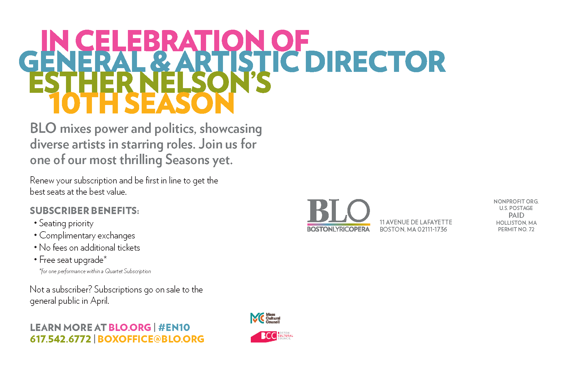
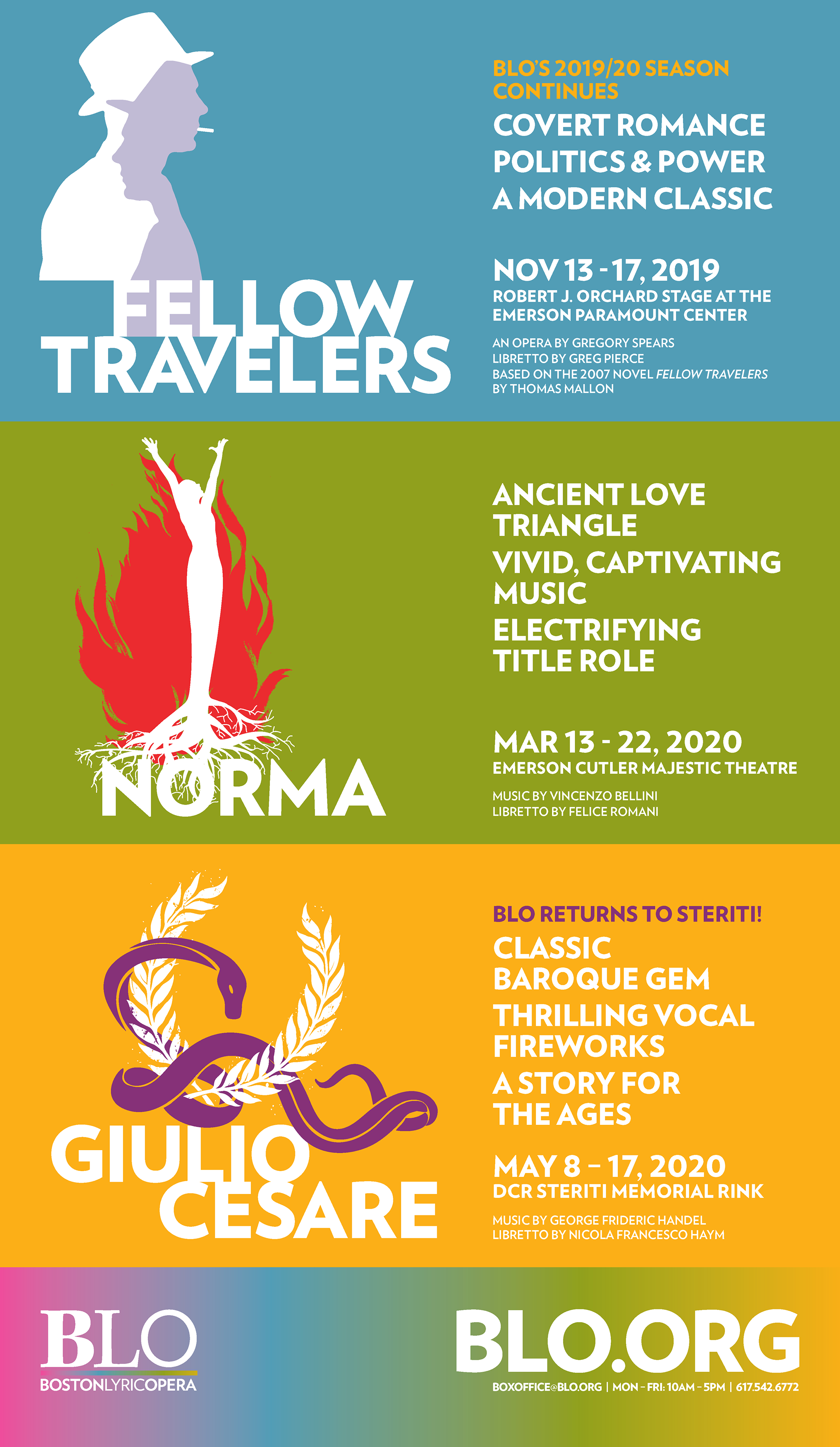
At the start of each Season, Boston Lyric Opera prepares branding for all productions. It is launched with a Season brochure, a postcard distributed at the final two productions of the previous Season, and is continued throughout the year with the postcards and venue signage for each production.
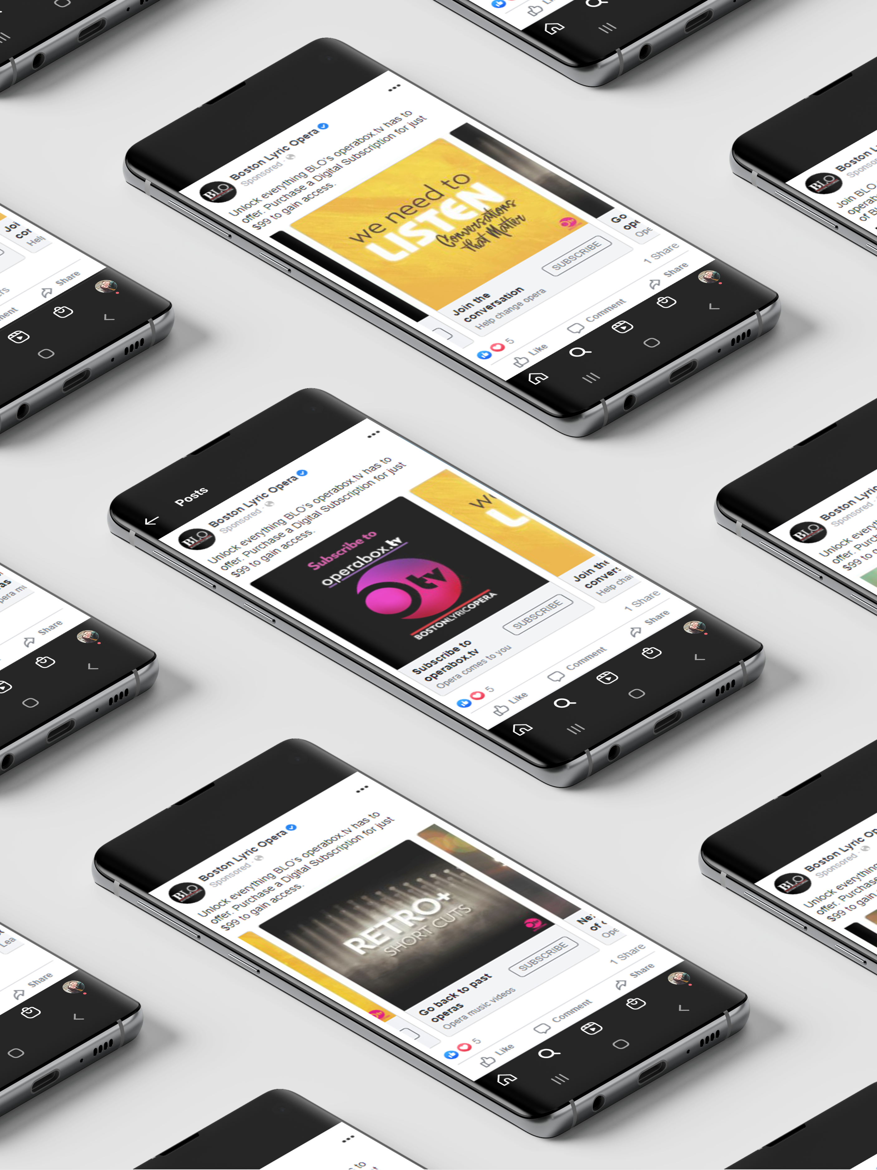
The 2019/20 Season broke with the companies traditional black, white, and red designs and utilized bold graphic images in a pair of colors for each production. The colors made for eye-catching ads and was memorable long after seeing it for the first time. The brand recognition was higher than ever including many social media posts and stories when the ads were spotted by BLO's patrons.

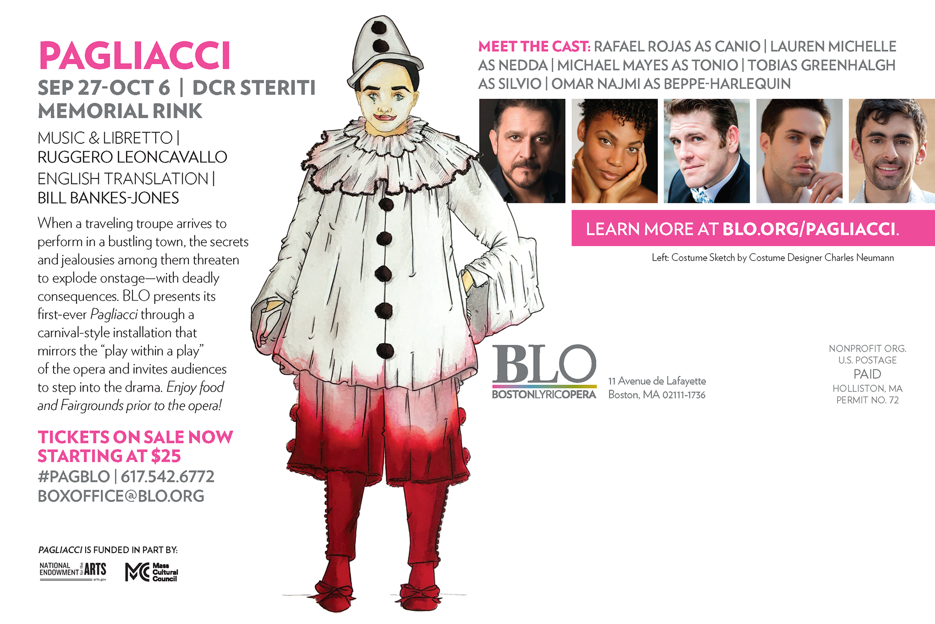

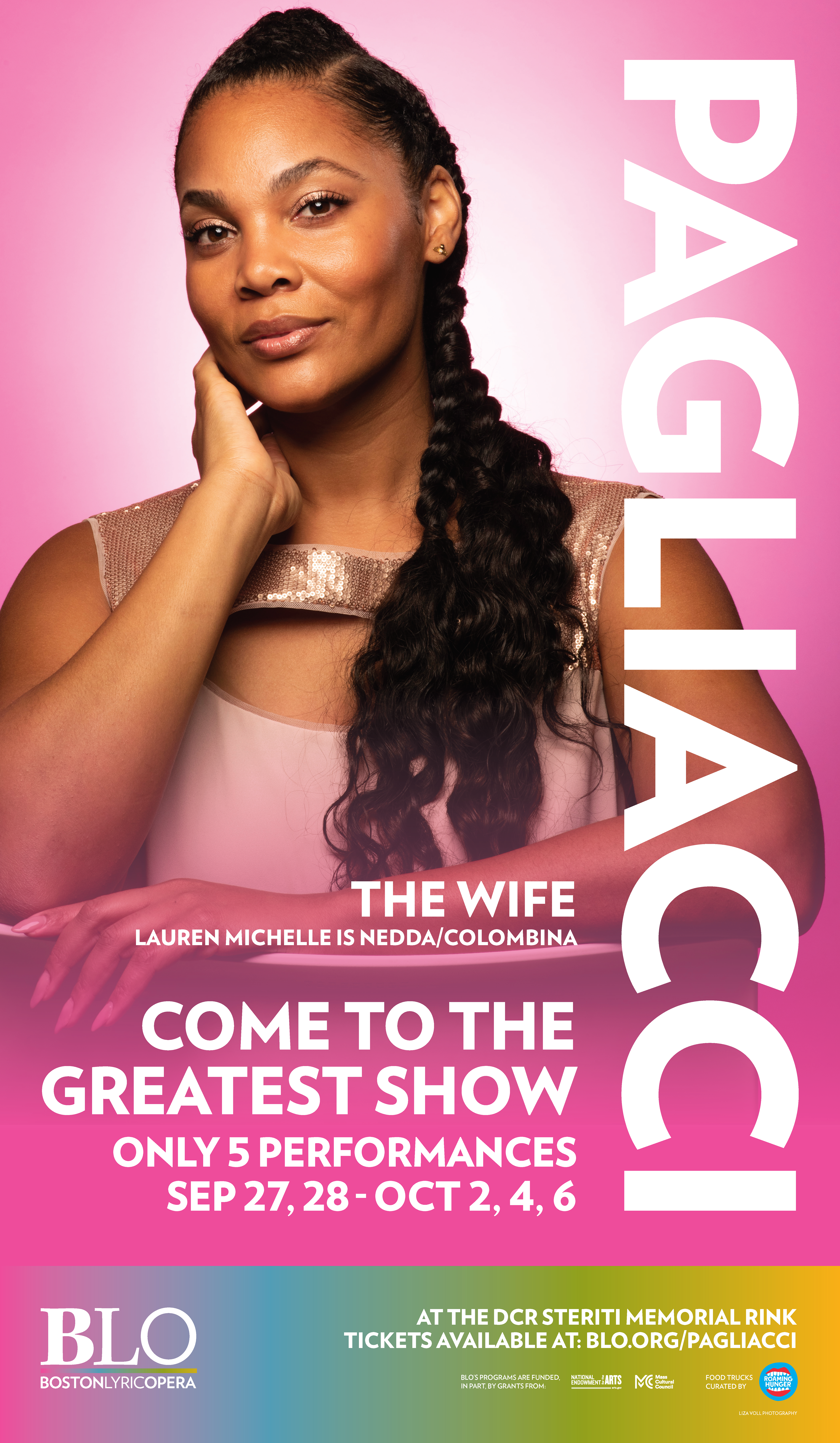
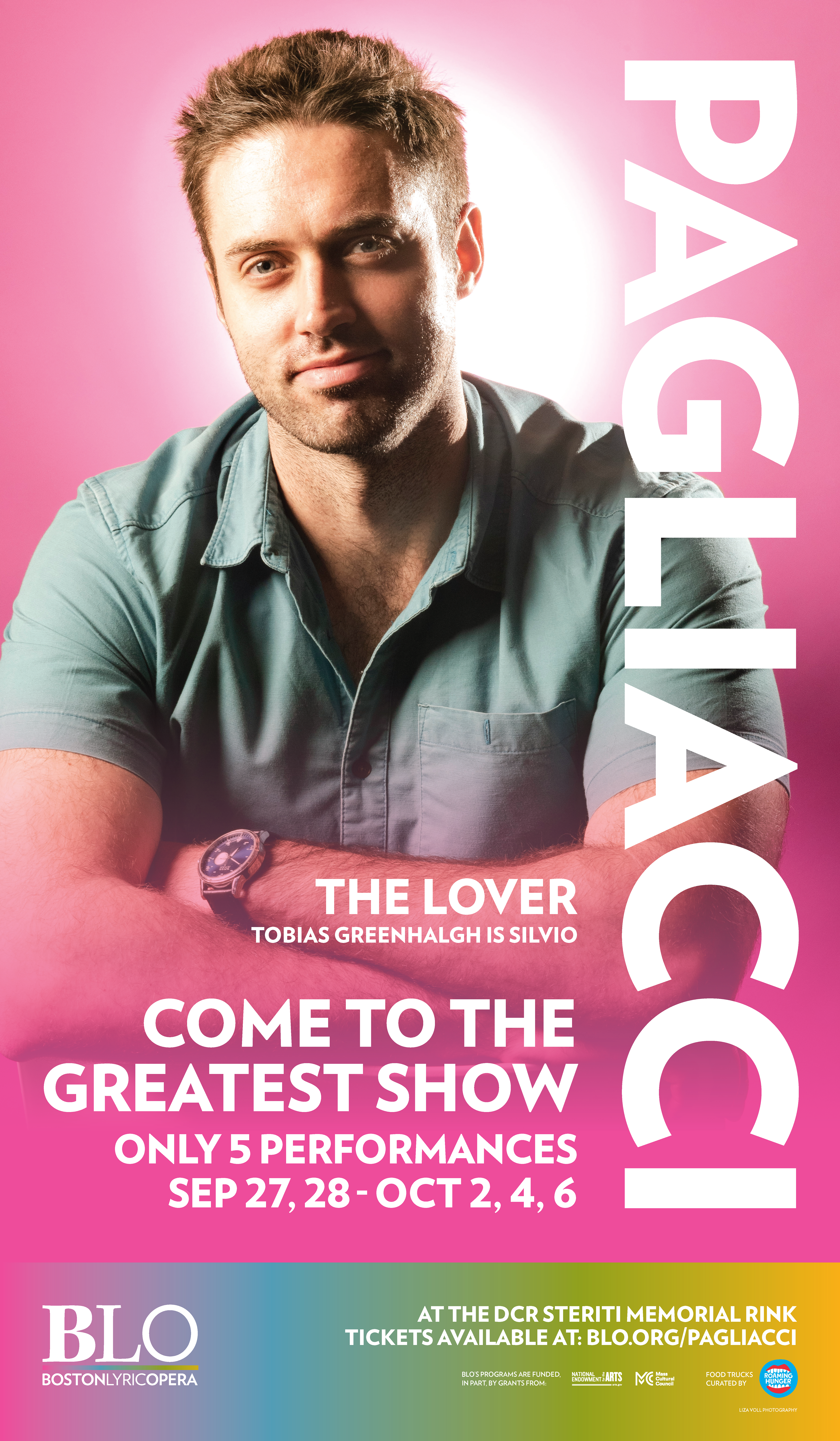
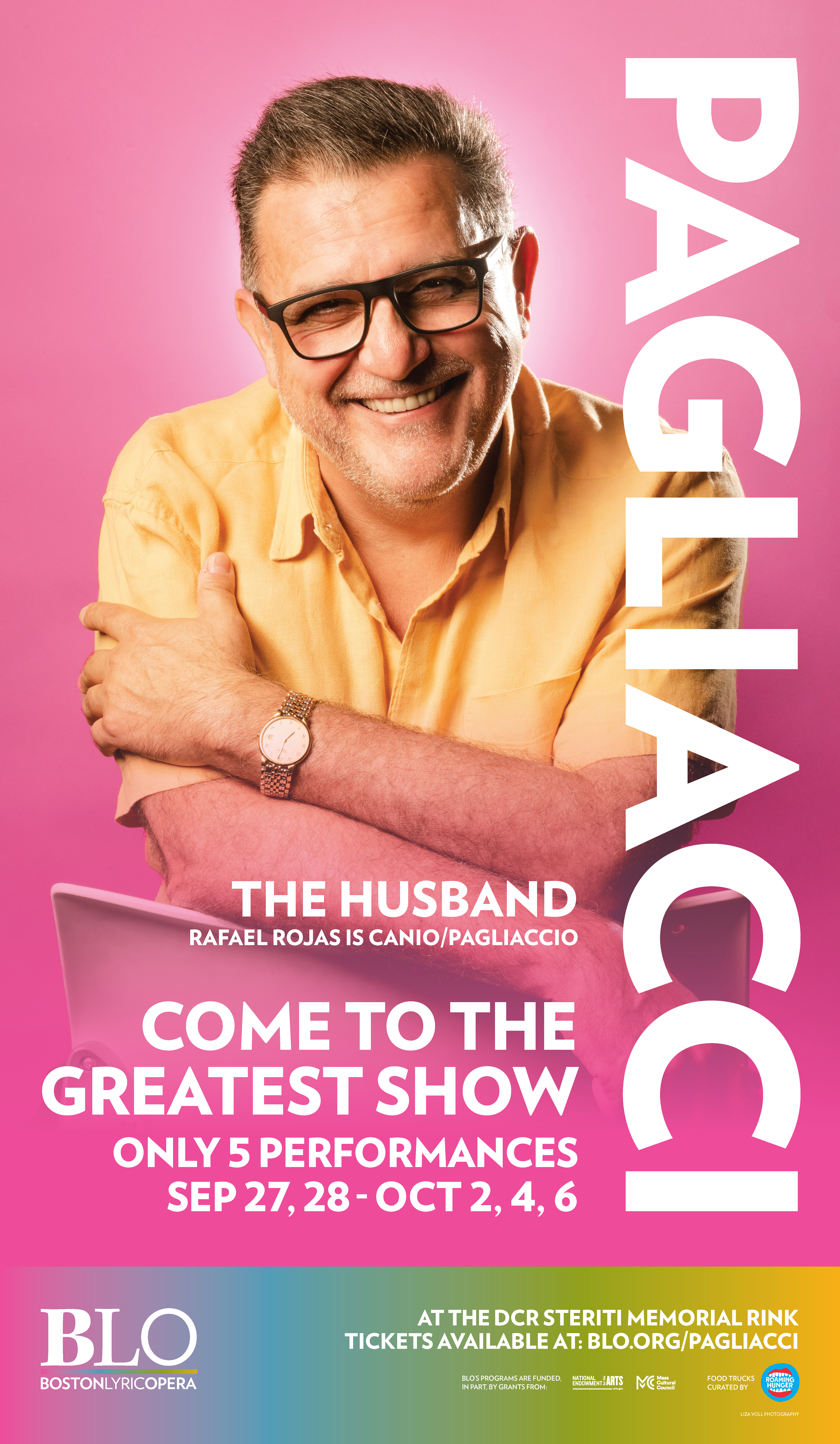
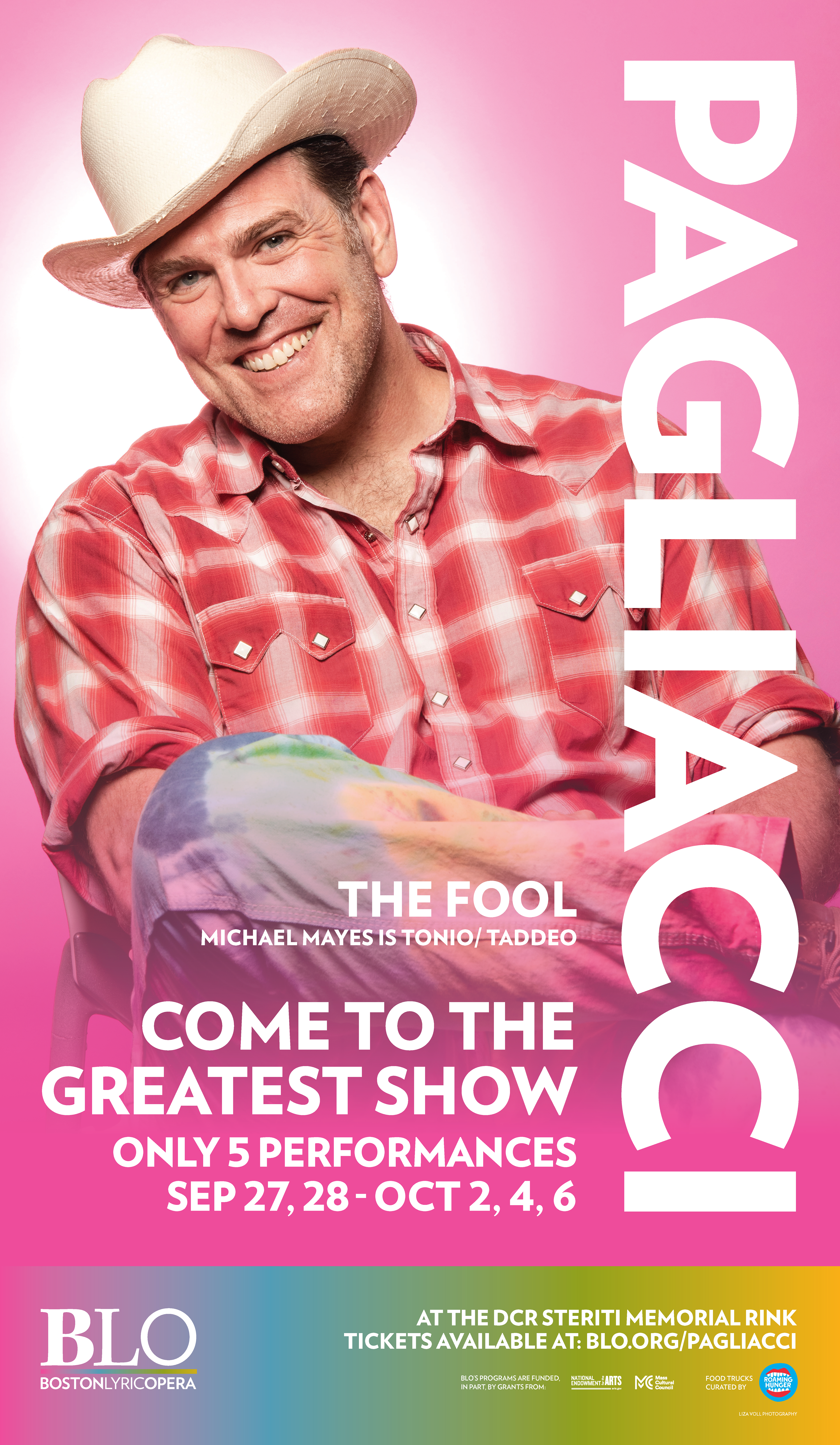
The "Pagliacci" postcard featured the graphic and the costume sketch on the back. The venue posters were located outside the venue in large windows by the street. The headshots, bright colors, and recognizable branding was easily spotted by pedestrians and drivers.
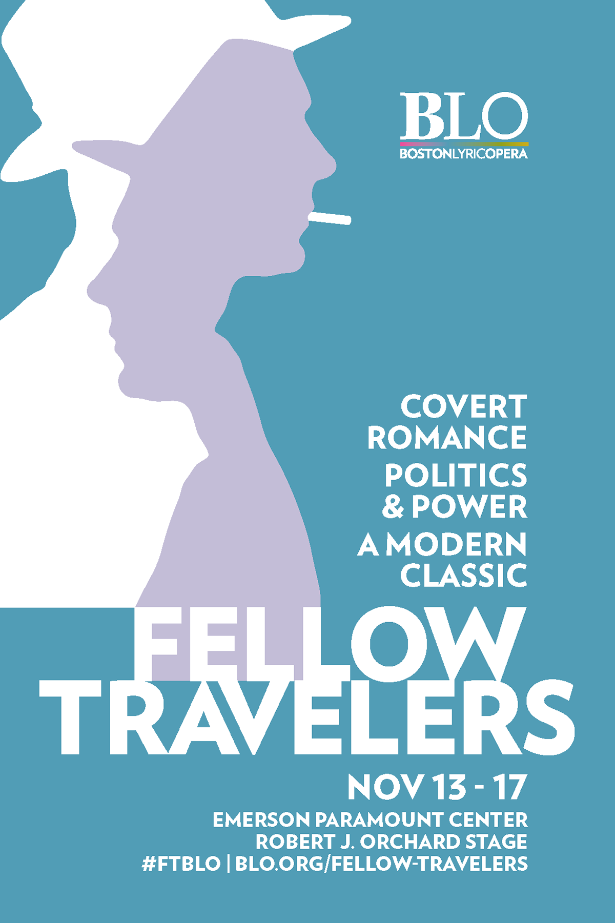
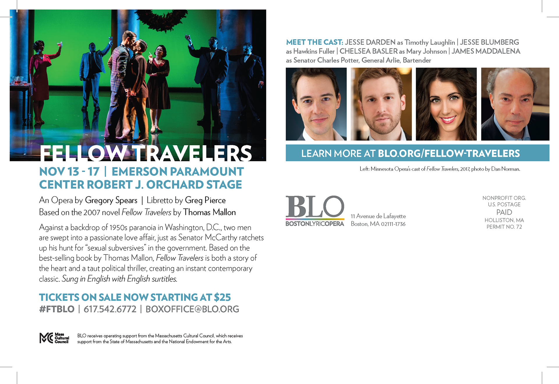
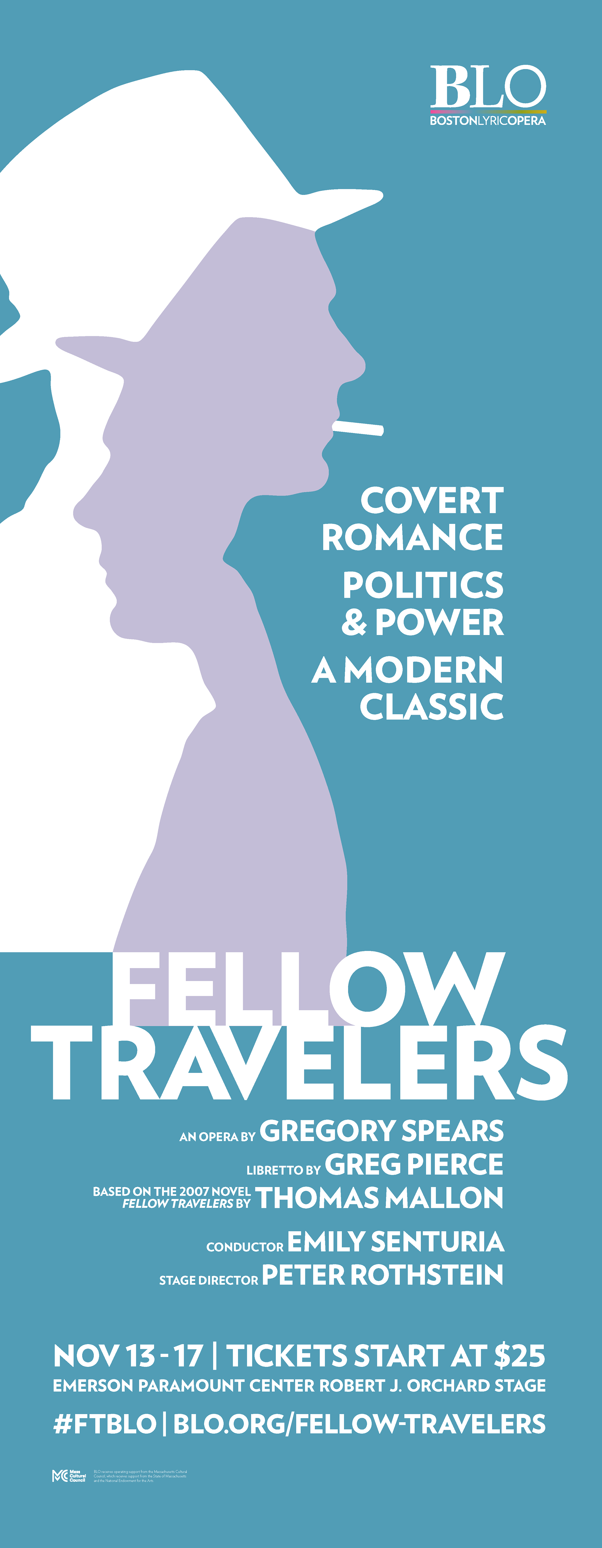
The "Fellow Travelers" postcard followed the same idea as "Pagliacci" but channeled 1950s colors and the look of the production in the design. The back featured a photo from Minnesota Opera's production and highlighted an iconic scene in the performance. The venue poster was less prominent as it was indoors. The light colors allowed it to stand out against the dark walls of the theatre.
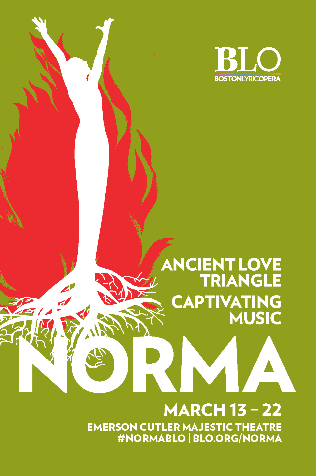

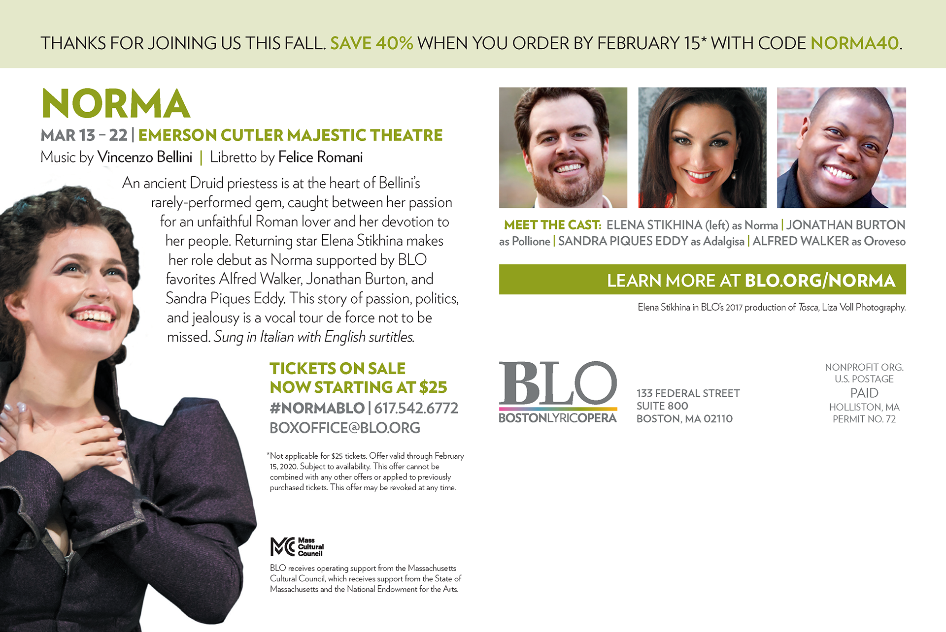
While "Norma" was cut short due the the pandemic, the postcard featured two segments. One was a generic postcard and another was a segmented list offering 40% off to recent ticket buyers and patrons in the Greater Boston Area.
